Yesterday morning, as a gale force wind blew snow in all directions, I found myself out on top of a pile of a hundred bales of hay trying to rope down a couple of tarps to keep the hay dry. It was a good moment for me, because it represented the first time I had gone at some crazy farm job without hovering family members afraid I might flip over another wheelbarrow. For some reason, this made me think you all might think that I was quiet on the blog because of lingering arm issues.
The actual reason for fewer blogs is that I have had my nose buried in the Green Hope Farm Flower Essence Guide rewrite all fall, and when I lift my head from this, it is because I am working with Jessica, our new staff goddess, on designing new labels for all our Flower Essence collections.
The Guide rewrite is drawing to a close. I expect to get the document to the printer in early January. Information about all the collections is going in under the one roof of this book. The St. John Flower Essences, ALL the Irish Flower Essences, the new Camino Flower Essences and ALL the Desert Flower Essences will be included, as well as all the other collections that have long resided within its pages.
Opening a box from us won’t be quite the flurry of loose papers it has been in the last few years and hopefully the more compact literature in the book will mean less trees going into our materials.
Lots of the graphics in the Guide book will reflect Jessica’s work on our logos. We will mark each page of the Flower Essence description section of the Guide with the appropriate logo. We hope this will help everyone know where they are in the document. In general, I think it is going to be an easier guide to navigate ( yes, I know that is not hard to imagine). Jess has even talked me into things like putting the different collections in alphabetical order! As she simultaneously works with Ben to rebuild the web site, and bring order to my right brain guidebook, its hard not to miss how much better organized and easier to understand EVERYTHING is going to be thanks to Jessica.
Right now, I am going through the guidebook to proofread my revisions. It’s always a great moment when I feel that a rewritten definition of an Essence expresses the Flower Essence’s strength and glory better than my last attempt- and there are lots of revisions that I feel are wonderful improvements, mostly because I have found some ways to cut to the chase.
Sometimes as I revise, the Angels and Elementals bring me to tears with insights new to me. Yesterday for example, I was proofreading the Irish definitions and mentioned to the Irish Elementals that it was hard to miss their loving focus on the disenfranchised. They answered my musings with words that I quickly copied down to put in the Guide,
“ We do focus on helping the dismissed, disempowered, invisible, and downtrodden. Finding ourselves similarly ignored has been our lot in the post industrial world. Consequently, we bring particular empathy and support to those of you who find yourselves in similar straits. Our Flower Essence gifts reflect our reaching across the silence that has too long divided us from each other, to find again our kinship and communion in a natural world held in high esteem. Once human and elemental alike were a cherished part of all that. Once this was the greatness of this land. May such times live again.â€
I also thought you might like another sneak peak at some of the new labels.
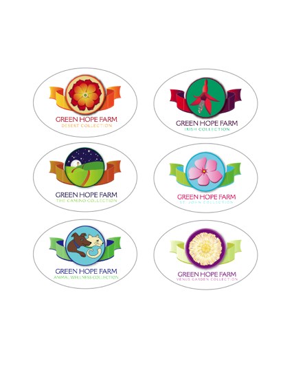
You have seen the Desert collection label before on the blog. It is a Claret Cup Cactus, a wonderful desert mandala in its own right. I love how the whole label echoes the colors of the deserts of the southwest. The center of the Flower is green and this seemed so wonderfully symbolic of the Desert Essences that bring everything back towards healing.
To the right is our Irish label. We tried many Irish Flowers before arriving at this label. Our attempts with Sea Campion were particularly earnest, but never led to anything that worked. When we tried Wild Fuschia, we loved the way it gave us an opportunity to bring in green, but not in a heavy handed way. We also love Wild Fuschia’s obvious joyfulness, as this is the way we feel about this collection.
Next comes the Camino label. This one took a lot of time and went through many revisions. We wanted to indicate the metaphor of the trail as the spiritual journey we ALL walk whether we get to the Camino in Spain or not. We found that when we designed a label that had the trail moving straight from foreground to horizon as it did during so much of Lizzy’s walk, there was a bleak quality to the image. Playing with the path dipping in and out of sight suggested the adventure of life much better. We also added the moon, stars, and the tower of a building in the background to deepen the image. The building in particular is meant to suggest how much of a role human community plays in our spiritual journeys and how this, along with the eternal verities, is a focus of these Essences.
Next to the Camino label is our label for the St. John collection. This was a hard label to do. We found that a lot of the Flowers we tried looked cliche. A bodacious babe sipping a pina colada while on spring break in Fort Lauderdale wasn’t quite the image we wanted to suggest. Eventually we settled on Madagascar Periwinkle for the Flower. We loved the way the colors of the whole label felt like tropical St. John and we felt that the power of this Flower Essence was a good representative for this great collection.
We decided to play around with our Animal Wellness Collection label while keeping it pretty close to the original. We tried various colors schemes, but chose this one as the freshest. Jessica had hope to make the dog look like her black lab, Brody, but when we made the dog black, it was impossible to see the face on the dog. Brody will just have to star in some other publication of ours!
The last label I have to share today ( there are actually four more, but I don’t have the right files to load them here) is the label for the Venus Garden Collection. This is a label of such incredible nuance thanks to Jess’s meticulous work on all the petals. The Flower is our much loved Mehera White Marigold. We think the label is elegant enough for this elegant powerhouse of a collection and of course, there is no Flower equal to Mehera!
Right now we wait for press proofs on these labels. We expect to have them aboard and in use at the beginning of January. We sent label queen Lynn home yesterday with the admonition to REST YOUR HANDS! She is going to be very busy come the new year!
Jess has built all these files in a format that means we can enlarge these labels to enormous banner size without pixilation- yet another phrase I never thought I would write- Anyways, we have had so many years of problems with labels, it is positively thrilling to have ones that I am confident will not give the printer nightmares!
Can’t wait to share all these and more with you dear people!